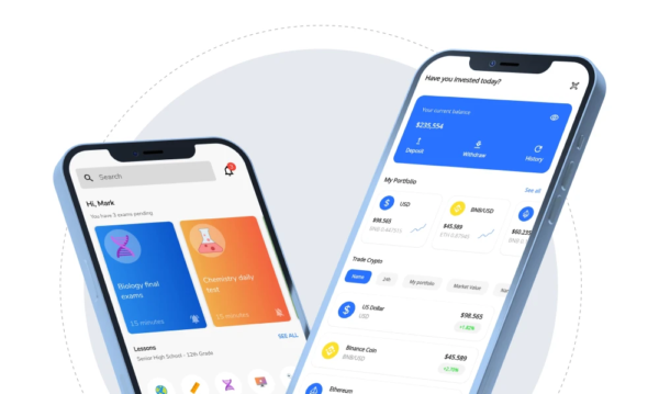
Introduction to Flutter UI Design
Flutter, a modern application development framework, a powerful UI toolkit, has completely transformed the way developers create beautiful, responsive user interfaces. This guide will walk you through the fundamentals of Flutter UI design, including key principles, practical implementation, and best practices. Whether you’re a seasoned developer or a UI UX design company, this blog will help you realize Flutter’s full potential.
What is Flutter?
Flutter is an open-source UI software development kit created by Google. It allows developers to build natively compiled applications for mobile, web, and desktop from a single codebase. Flutter stands out due to its high-performance rendering engine and the rich set of pre-designed Flutter widgets, which makes it an ideal choice for both prototyping and production-level applications.
Benefits of using Flutter for UI Design
Flutter offers numerous benefits for UI design, including:
Fast Development: Hot reload feature allows for quick iterations.
Expressive and Flexible UI: A rich set of customizable Flutter widgets.
Native Performance: Compiled directly to native ARM code.
Cross-Platform: Single codebase for Android, iOS, web, and desktop.
Key Concepts: Widgets, Widget Tree, State Management
Widgets – The Building Blocks of a Flutter UI Design
In Flutter, everything is a widget. Widgets are the basic units of a Flutter UI design, representing elements of the user interface like buttons, text fields, images, and layouts. They are responsible for both the structure and the appearance of the app. Flutter offers a rich set of pre-built widgets for both Material Design (for Android) and Cupertino (for iOS) styles, ensuring your app can provide a native look and feel across different platforms.
Widget Tree – The Hierarchy of Widgets
The widget tree is a hierarchical structure that represents the arrangement of widgets in a Flutter application. Similar to how a tree has branches and leaves, a Flutter app is composed of a tree of widgets, where each widget can have one or more child widgets.
1. Composition: By composing smaller widgets into larger ones, you can build complex and sophisticated UIs. For example, a Column widget can contain multiple Text widgets to display a vertical list of text elements.
2.Parent-Child Relationship: In the widget tree, parent widgets can contain one or more child widgets. This relationship determines how widgets are nested and displayed on the screen.
State Management – Handling the Dynamic Aspects of the App’s UI
State management is a crucial aspect of Flutter UI design. It involves managing the state, or the data that can change over time, and ensuring that the UI reflects these changes. Proper state management is essential for creating responsive and interactive applications.
1.Lifting State Up: When multiple widgets need to share and modify the same state, you lift the state up to their closest common ancestor. This ensures a single source of truth and helps maintain consistency.
2.State Management Solutions: For larger and more complex applications, Flutter offers various state management solutions like Provider, Riverpod, Bloc, and Redux. These solutions help manage the state in a more scalable and maintainable way.
3.Local State: Managed within a single widget using setState(). This is suitable for small-scale state changes that do not affect other parts of the app.
Flutter UI Design Principles
Flutter is built with Material Design principles at its core, providing a cohesive and intuitive design language that enhances the user experience across different devices and platforms. Let’s dive deeper into the core principles and components of Material Design in Flutter:
Material Design emphasizes three fundamental principles—light and shadow, vibrant colors, and bold typography.
Light and Shadow: Material Design uses shadows to create a sense of depth and hierarchy, making it easier for users to understand the structure of the UI. In Flutter, you can apply shadows to widgets using properties like elevation to give them a raised appearance, enhancing the visual depth of your app.
Vibrant Colors: Colors play a crucial role in Material Design. They help convey the theme and brand of the application while guiding user interactions. Flutter provides a flexible color palette and tools to define primary, secondary, and accent colors. You can customize colors using the Colors class and create consistent themes using ThemeData.
Bold Typography: Typography in Material Design is bold, clear, and highly readable. Flutter supports various text styles that can be easily customized using the TextStyle class. By leveraging different font weights, sizes, and styles, you can ensure your text elements stand out and are easily readable.
Using Material Components: Flutter includes a wide range of Material Design components that help you build a cohesive and functional UI. These components are pre-designed to follow Material Design guidelines, ensuring a consistent look and feel throughout your app.
1.App bars provide a consistent place for titles, navigation, and actions. In Flutter, the AppBar widget can be customized to include titles, icons, and menus.
2. Flutter offers various button widgets, including ElevatedButton, TextButton, and IconButton. Each type of button serves a different purpose and can be styled to match your app’s theme.
3.Cards are used to represent related data and actions. They help group information in a visually distinct container. In Flutter, the Card widget can include text, images, and buttons, providing a flexible way to present content.
Cupertino
For apps targeting iOS, Flutter provides Cupertino widgets that adhere to Apple’s Human Interface Guidelines. These widgets offer a native iOS look and feel, ensuring that your app feels at home on both platforms. Cupertino widgets help maintain platform consistency and provide a seamless user experience for iOS users.
Flutter includes a variety of Cupertino components designed to mimic native iOS controls and patterns. Some key components include:
1.CupertinoNavigationBar: A navigation bar that looks and feels like the native iOS navigation bar, offering smooth transitions and a consistent iOS appearance.
2.CupertinoButton: A button that follows iOS design guidelines, providing a sleek and responsive touch interface.
3.CupertinoPicker: A picker control that mimics the iOS picker, allowing users to select from a list of options with a familiar scrolling motion.
Building App Interfaces with Flutter
Understanding Widgets:
- Stateless vs Stateful Widgets
Stateless Widgets: These widgets are immutable, meaning their properties cannot change once they are created. They are ideal for static parts of the UI that do not require updates. For example, a Text widget displaying a label is typically stateless.
Stateful Widgets: These widgets can change their state over time, allowing for dynamic and interactive interfaces. Stateful widgets are perfect for elements that need to update in response to user interactions or other events. For example, a Checkbox widget that changes its appearance based on user input would be stateful.
- Building Custom Widgets
You can create reusable and customizable widgets to encapsulate specific functionalities and designs. Custom widgets help maintain a clean and organized codebase by breaking down complex UIs into manageable components. By extending StatelessWidget or StatefulWidget, you can define your own widgets, incorporating properties and methods tailored to your app’s requirements.
- Composing Widgets for Complex UIs
Flutter’s compositional model allows you to build sophisticated interfaces by combining multiple widgets. You can nest widgets within each other to create intricate layouts. For instance, a complex form can be built by composing TextField, DropdownButton, and Checkbox widgets within a Column widget, creating a cohesive and functional user interface.
Layouts:
- Row, Column, Stack, and other layout widgets
Row: This widget arranges its children horizontally in a single line. It’s useful for creating horizontal layouts, such as a row of buttons or images.
Column: This widget arranges its children vertically. It’s ideal for creating vertical layouts, like a list of text fields or a column of images.
Stack: This widget allows you to stack widgets on top of each other, useful for creating layered UI elements, such as overlaying text on an image.
- Organizing UI elements with Layouts
Using layout widgets like Container, Padding, and Align, you can control the spacing, alignment, and positioning of UI elements. By combining these layout widgets, you can create responsive designs that adapt to different screen sizes and orientations, ensuring a consistent user experience.
Styling:
- Colors, Text Styles, and Decoration
Colors: Define colors using the Color class or pre-defined color constants from the Colors class. You can apply colors to backgrounds, text, and other UI elements.
Text Styles: Customize text appearance using the TextStyle class. You can define font size, weight, color, and other properties to create visually appealing and readable text elements.
Decoration: Use the BoxDecoration class to apply decorations such as gradients, borders, and shadows to widgets. This allows for rich visual customization and enhanced aesthetics.
- Using Flutter’s Theme for Consistent Styling
Define global styles and themes using the ThemeData class. By setting a global theme, you ensure consistent styling across your app. You can customize primary and accent colors, text themes, and other properties to match your brand’s identity. Applying a theme ensures that all widgets adhere to the same styling rules, providing a cohesive look and feel throughout the application.
Creating Interactive UIs with Flutter
Interactivity is at the heart of a great user experience. Flutter excels in providing a rich set of tools for handling user input, gestures, and navigation, making it easy to build dynamic and engaging applications. Let’s expand on these key areas.
User Input: Text Fields, Buttons, Forms
Text fields are used to capture user text input. In Flutter, the TextField widget allows you to create customizable text input fields. You can control properties like placeholder text, input type (e.g., email, password), and validation logic.
Buttons trigger actions and come in various styles to suit different use cases. Flutter offers several button widgets, including ElevatedButton, TextButton, OutlinedButton, and IconButton.
Forms are used to group multiple input fields and handle validation collectively. The Form widget in Flutter works with FormField widgets like TextFormField to manage input state and validate data.
Handling User Interactions with Gestures (Taps, Swipes):
GestureDetector widget to capture various gestures like taps, swipes, pinches, and drags. You can define specific actions to be performed when a gesture is detected.
Navigation:
- You can define routes in your app and navigate to them using the Navigator widget.
- The Navigator widget manages a stack of routes, enabling you to push and pop routes to navigate between screens. This is crucial for creating a smooth and intuitive navigation flow in your app.
Best Practices for Flutter UI Design
- As much as possible, use stateless widgets. They are simple to test and manage because they have fewer side effects.
- Keep widgets compact and reusable to improve code modularity and reduce duplication. It is possible to use composition and inheritance to maximise widget reuse.
- To handle state, use the widget tree. Flutter provides a widget tree to manage the state of your app, keeping your code organised and easy to understand.
- The Business Logic Component (BLoC) pattern can separate business logic and view levels. Overall, this simplifies code testing and maintenance.
- Use as few third-party packages as you need for your app.
- Use the dart analyse command-line tool to improve the readability and consistency of your code. The Dart analyzer checks your code for common errors and formatting issues.
- To keep your app responsive and lightweight, use lazy-loading for lists, limit the number of widgets, and avoid complex computations on the UI thread.
- Poor coding frequently degrades a positive user experience. To improve your app’s efficiency, remove unnecessary loops, replace literals with constants, and create as few objects as possible.
- Use async and await to improve responsiveness and avoid stopping the UI thread. It is critical to ensure smooth interactions without performance issues.
Additional Resources
Check out Flutter for: Android, SwiftUI, UIKit, React Native, and Xamarin.Forms developers.
Building layouts: Learn how to create layouts in Flutter, where everything is a widget.
Understanding constraints: Once you understand that “Constraints flow down. Sizes flow up. Parents set positions”, then you are well on your way to understanding Flutter’s layout model.
Adding interactivity to your Flutter app: Learn how to add a stateful widget to your app.
These Flutter videos, produced both internally at Google and by the Flutter community, might help if you are a visual learner.
Note that many people make Flutter videos. This page shows some that we like, but there are many others, including some in different languages.
Conclusion
Flutter offers a robust framework for building beautiful and responsive app interfaces. By understanding its core principles and applying best practices, you can create stunning and efficient UIs that provide a seamless user experience. Whether you’re a developer or part of a design agency, Flutter’s capabilities can elevate your mobile app development to new heights.
With this comprehensive guide, you’re now equipped to harness the full power of Flutter in your UI design endeavors. Happy coding!