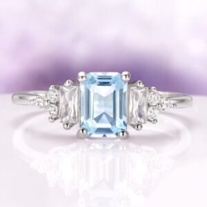
A pale-blue stone is a quiet thing. It does not shout the way a warm, saturated gem does, and that restraint is exactly what draws people to it. But quiet stones are also the most sensitive to their surroundings. The metal you cradle a cool blue gem in, and the way that metal is shaped into a setting, can push the stone toward crisp and icy or toward soft and vintage, all without touching the gem itself. Before you fall in love with a single design, it helps to understand the levers you are actually pulling. A good place to browse and compare tones side by side is aquamarise.com, where the same style often appears in more than one metal so you can see the shift for yourself.
White Metals and Warm Metals Read Differently Against a Cool Stone
The first and largest decision is tone. Cool white metals sit in the same temperature family as a pale-blue gem, so the two agree with each other. A white setting reflects a neutral, silvery light back into the stone, which lets the blue stay blue and keeps the whole piece feeling clean and modern. Nothing competes for attention, and the color reads as pure as it can. Warm yellow metals do the opposite. They introduce a golden note next to a cool one, and that contrast is not a flaw at all, it is a choice. A warm frame makes the blue look more relaxed and a touch softer, and it leans the design toward a heritage or antique mood. Rose tones split the difference, adding a gentle pink warmth that flatters the stone while still reading tender rather than icy. None of these is correct or incorrect. The point is that the metal is not a neutral holder. It is a colored light source sitting a millimeter away from the gem, and it always has an opinion.
Prong, Bezel, and Halo Settings Each Handle Light in Their Own Way
Once tone is settled, the shape of the setting decides how light reaches the stone. Prongs are the classic answer, small claws that lift the gem and leave most of its surface open to the air. That openness is the whole appeal, because light can enter from nearly every angle and a pale stone benefits from all the brightness it can gather. A bezel wraps a thin rim of metal fully or partly around the girdle instead. It gives a smooth, contemporary silhouette and, when the rim is a cool white tone, it frames the blue like a clean border. A bezel does let in a little less light from the sides, so a very pale stone can look marginally more contained, which some people love for its calm, modern feel. A halo rings the center stone with a circle of tiny accent stones. That ring adds sparkle around the edge and can make a modest center look larger and brighter, though it also surrounds the blue with white fire, so the center reads cooler and more brilliant than it would standing alone.
 A cool white metal keeps the focus on the stone’s own blue.
The Setting Both Protects the Stone and Presents It
A setting has two jobs that sometimes pull in opposite directions. It has to hold the gem securely, and it has to show the gem off. Prongs lean toward presentation, lifting the stone into the light and exposing more of it, which is wonderful for brilliance but leaves the edges more open. A bezel leans toward protection, tucking the vulnerable girdle behind a rim of metal so the stone sits a little more shielded within its frame. Neither approach is only about looks or only about security, and the tone of the metal quietly shapes both. A protective bezel in a warm tone reads soft and enclosing, while the same bezel in a cool tone reads architectural and sharp. When you weigh options, it helps to think about how a stone will actually be worn day to day rather than only how it looks under a jeweler’s spotlight. If you want to see how these trade-offs play out across real designs, spend time with the aquamarine engagement ring collection at Aquamarise and notice how the same pale stone shifts personality as the setting changes around it.
Low Profile Versus High Profile for Everyday Wear
Profile is how high the stone sits above the band, and it changes both the look and the practicality of a ring. A high profile lifts the gem up and away from the finger, which floods it with light and gives a dramatic, elevated presence. It photographs beautifully and lets a pale stone catch every bit of brightness. The trade-off is that a raised stone sits more in the path of daily life, catching on fabric and knocking against surfaces more often. A low profile nestles the stone close to the band, giving a sleek, grounded look that slips under a sleeve without snagging and feels effortless for hands that are always busy. Metal tone rides along with this choice too. A low, cool-toned setting reads especially modern and understated, while a high, warm-toned setting reads romantic and showy. Think honestly about the life the ring will lead, then let profile follow that answer rather than the other way around.
Texture and Band Width Change the Whole Balance
The band is not just a support beam, it is part of the composition. A narrow band makes the center stone look larger and more delicate at once, drawing the eye straight to the gem and letting a pale blue feel airy and light. A wider band gives a bolder, more substantial impression and can make a cool stone feel anchored and confident. Texture adds another layer. A high-polish band throws bright, mirror-like reflections that amplify the crisp quality of a cool stone, while a matte or brushed finish softens those reflections into a muted glow that leans quiet and contemporary. Details like a twisted rope motif, tiny beaded edges, or a hammered surface all add movement and character. On a warm metal these textures read heritage and handcrafted. On a cool metal they read sculptural and current. The band is where a lot of personality lives, so it deserves as much thought as the setting that holds the stone.
Matching Metal Tone to Skin and Wardrobe
Metal tone does not sit in isolation, it sits against skin and clothing every day. As a general guide, cool white tones tend to harmonize with cooler complexions and with wardrobes built on gray, navy, black, and jewel colors, echoing the same crisp temperature as a pale blue stone. Warm yellow tones tend to flatter warmer complexions and pair naturally with earthy, cream, and golden palettes, adding a gentle glow that a cool stone can play against. Rose tones are famously easygoing and suit a wide range of skin, offering warmth without going fully golden. None of this is a rule to obey so much as a starting point to test. The most reliable method is simple: try a cool tone and a warm tone against your own hand in natural daylight and notice which one makes both your skin and the stone look their best. Your eye will usually tell you quickly, and that instinct is worth trusting.
Bringing the Decisions Together
A pale-blue stone gives you a rare kind of freedom, because it is calm enough to look at home in almost any frame. That is also why the frame matters so much. Tone sets the temperature, the setting style directs the light, the profile decides how the ring lives on a hand, and the band and texture tune the balance and mood. Read those choices as a set rather than one at a time, and picture the ring in daylight on a real hand rather than under a display lamp. Do that, and the metal stops being an afterthought and becomes the thing that lets a quiet blue stone say exactly what you want it to say.